
Jurassic Park scan looks like crap?
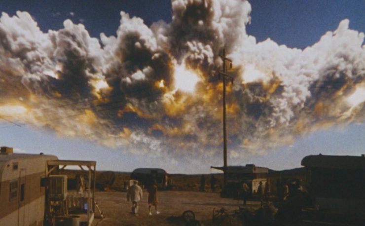
A while ago some dedicated fans scanned a theatrical print of Jurassic Park, graded it, and released it. Here is a screenshot:
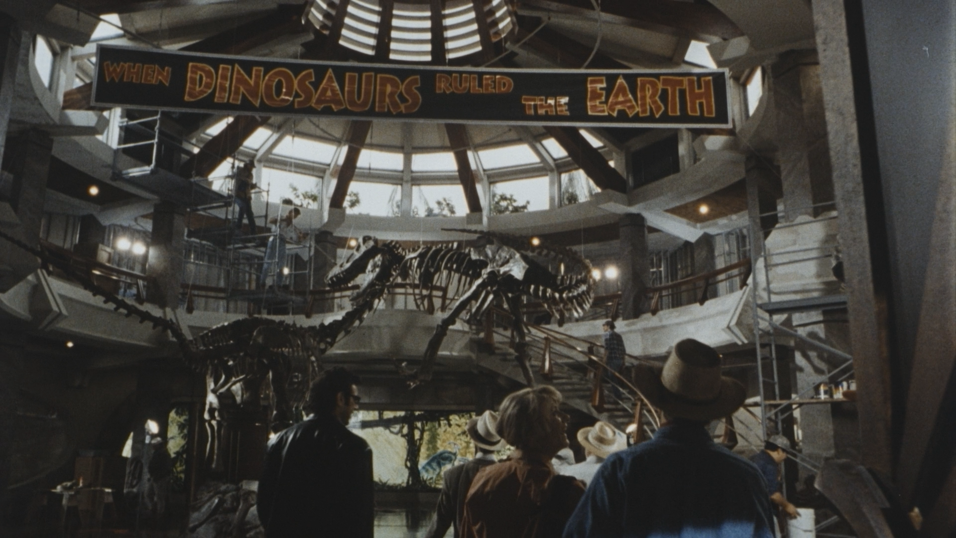
You can of course find it in the usual places – Myspleen, Bloodsuckerz, usenet, etc. Some people liked it, and others it seems thought it looked like total shit! A topic on 4Chan had some interesting criticisms and “insights”. It’s worth noting that they were “critiquing” the lower quality 720p AVCHD that yours truly made, not the full quality 1080p release. Here are some of the comments:
JP is desaturated as fuck but thats how the master reel looked in 1993
Anonymous
that’s not what it looked like
Anonymous
this looks like absolute dogshit. how was this scanned, with a camcorder?
Anonymous
So it was from a 16mm print, not 35?
Also it doesn’t say how it was scanned. For all we know it was captured with a video camera
Anonymous
For comparison, here’s a screenshot from what one of the commentators on 4Chan called the “color correct home release”:
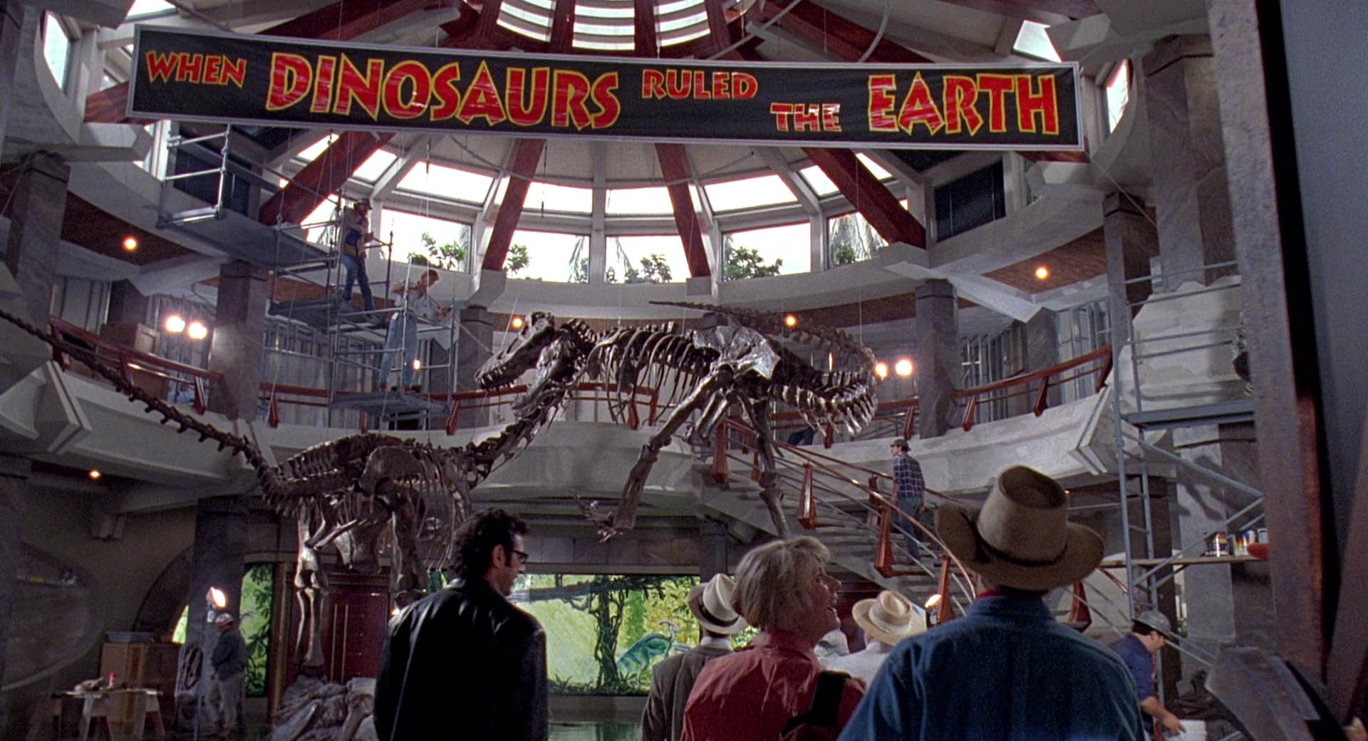
Oh sure, so the interior walls are supposed to look red and purple? This is an example of a poor quality home release – there’s just nothing good about this screenshot. It’s noisy, ugly, and the colours are all over the place. If you put this side-by-side with the print scan then the print looks “dull”, that’s true. Cinemas project films in total darkness, and that affects the viewing experience. If you’re watching it in a brightly lit room I imagine it will look duller than patrons would have experienced in the theatre in 1993. But look what happens when I regrade the Bluray to match the print scan:
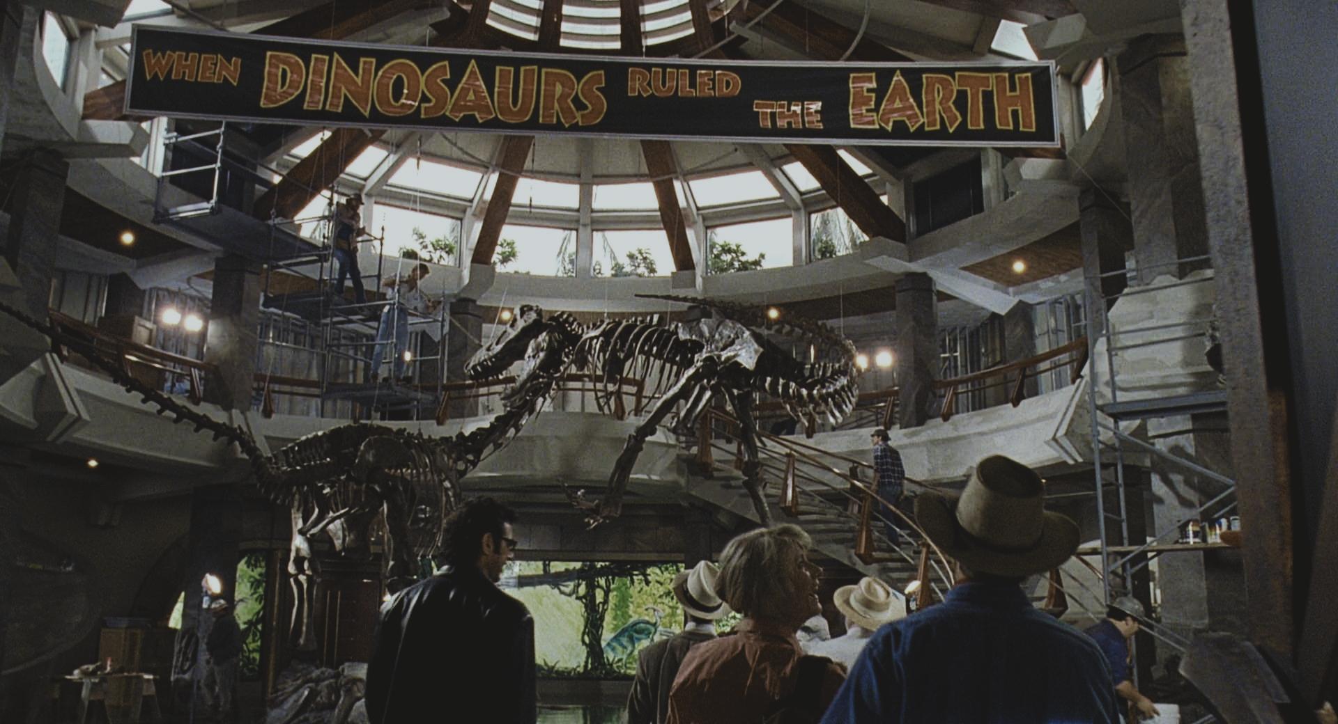
Does that not look much more natural? Well you can decide for yourself.
I haven’t seen the raw scan that the fans did, only the released version. I do know that it was handled by people with extensive experience in the industry, and that it was professionally colour corrected and graded to the projected print. I also know from viewing 35mm films recently, that a lot of films look similar to Jurassic Park when projected from their theatrical prints. This does serve as a good example of why home video release often don’t match the look of theatrical prints. A good release however can still strike a balance between preserving the original flair and creativity of the film-maker, whilst enhancing and optimising the viewing experience for home use. For example, the darkness of the T-Rex chase scene could never be made out if not brightened for older analogue formats. It’d be great to see a more faithful release of this film in the future, but given the revisionism of the 3D release that may be a long while off. The 3D version of the film was regraded to make the film much warmer than it was originally:

I wouldn’t say the grading looks “bad”, it is much more palatable than the previous release. But the new grading is much warmer than on the 35mm print that was scanned (an intentional “creative” decision), one notable difference is the sky is blue on the print, and orange on the 3D release in many scenes.
Jurassic Park is © 1993, Universal.

[…] the previous post, I used DrDre’s excellent color matching tool. It works even better with high-bit […]